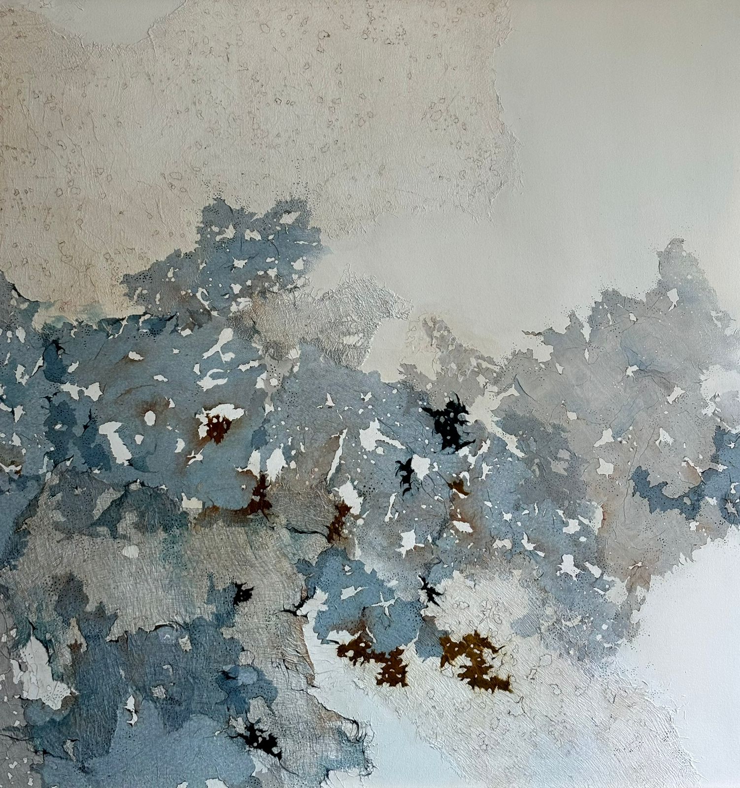
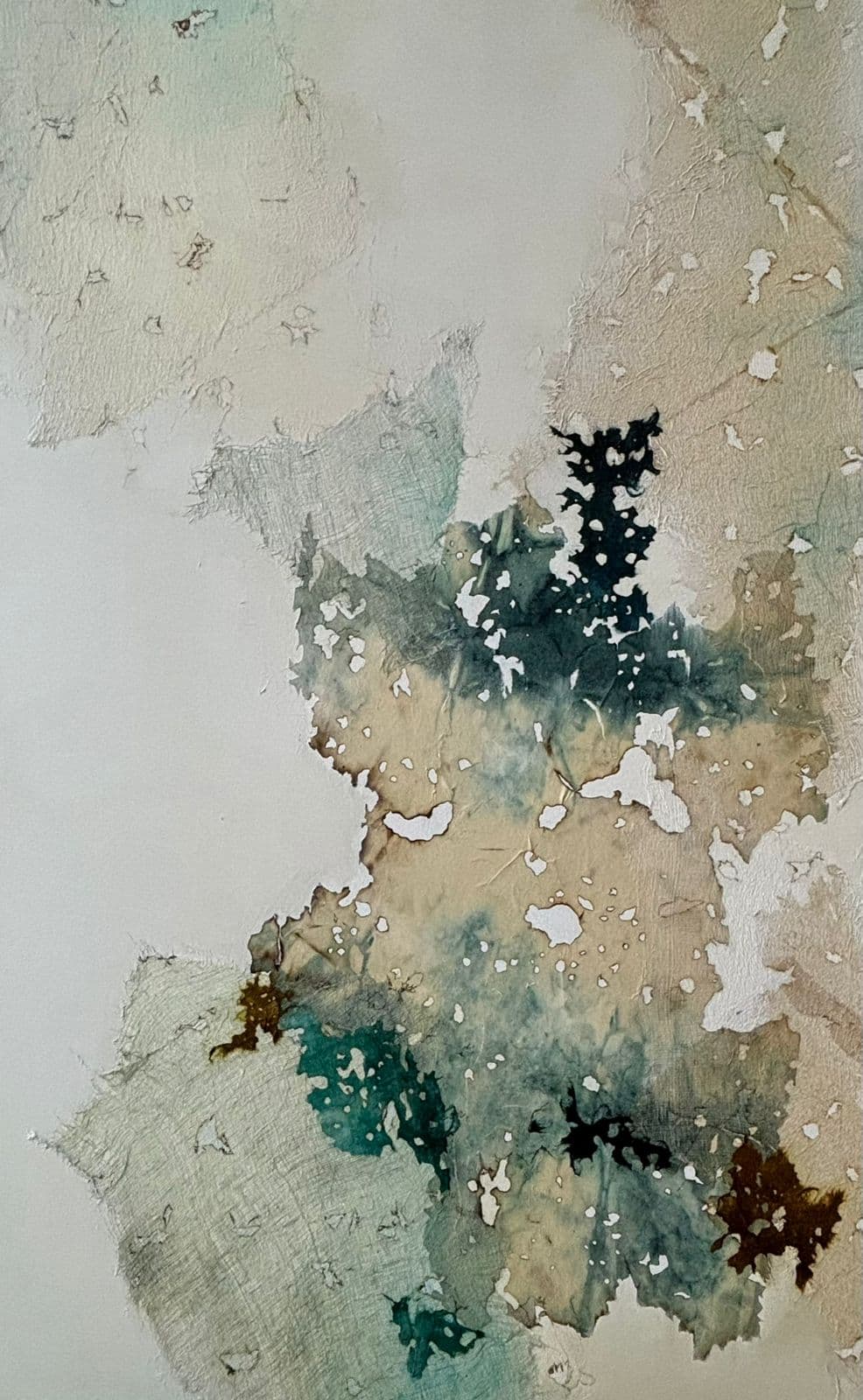
Madhuri works intuitively with gauze rice paper and induces colours with dyes and burnt paper. Textural variations are created to reveal details and complexities within the image. Materials are deconstructed ripped burnt and dyed and it is during this process that the clothes papers and colours form a unique abstract pattern. She finds inspiration in everything nature its the icy landscapes of Swe...
Madhuri works intuitively with gauze rice paper and induces colours with dyes and burnt paper. Textural variations are created to reveal details and complexities within the image. Materials are deconstructed ripped burnt and dyed and it is during this process that the clothes papers and colours form a unique abstract pattern. She finds inspiration in everything nature its the icy landscapes of Sweden that prompted her to introduce whites and blues in her recent works. Her palette gravitates towards the use of sea green blue purple pale yellow and burnt orange soft hues that she associates with a sense of calm. She has held various solo shows at Bajaj Art Gallery Devlalikar Art Gallery and Kala Ghoda Walk in Gallery to name a few of them. In addition she has actively participated in multiple group shows across borders like Germany and Switzerland. Kathe has been facilitated by prominent art critics institutions and art houses.


.jpg&w=750&q=75)